Season summary
What each section of the team card means?
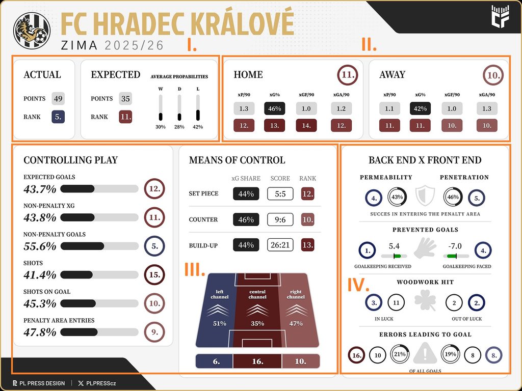
II.
While generally a self-explanatory section, it needs to be noted that the 4 metrics featured on the visual are not the only ones considered for the overall rank of home/away form circled above; they are just the poster faces. Additionally, I look at e.g. the team's tendency to press and win balls up high or foul down low. From among stats speaking to one team's control over the game, I am not only going off xG vibes as it may seem; goal, all atempt and shot on target shares are also part of the equation.
III.
The so-called "shares" that dominate in this section are not commonly used in the Czech football community when they arguably should be, as they reflect the situation at both ends of the pitch equally. In the case of shot share, for example, the percentage expresses how big a portion of shots the team in question is responsible for. Once put all together, this set of metrics does indeed give you a solid snapshot of how the said team controls play. This is especially interesting in the case of the pitch divide, where the percentages for each channel (left-central-right) tell you how much in control of the overall xG flow the team was. Finally, with the set piece, counter and build up sub-section, we include the raw score for a full picture, but the rank is based solely on xG shares — we are still the geeks.
IV.
You may notice the logic behind the visual now: with each section, we are basically zooming in a bit more. Here, we reach the end by focusing on both penalty areas, specifically how easily they are entered (success rate with penalty area entries from open play), and how much of a supporting cast both goalkeepers as well as posts and crossbars have been along the way. It is — in my view at least — a fun bit of a punchline to the wholly serious visual, concluded with a balance sheet of error for both the team in question and its opponents. These errors are tracked by myself across the whole season, so ultimately subjective, but I only count the truly major ones. Do not worry. For errors and woodwork, by the way, the higher ranking for the "front end", the more the team benefitted in that area (ie. the more errors taken advantage of; the less woodwork rattled).
Depth chart
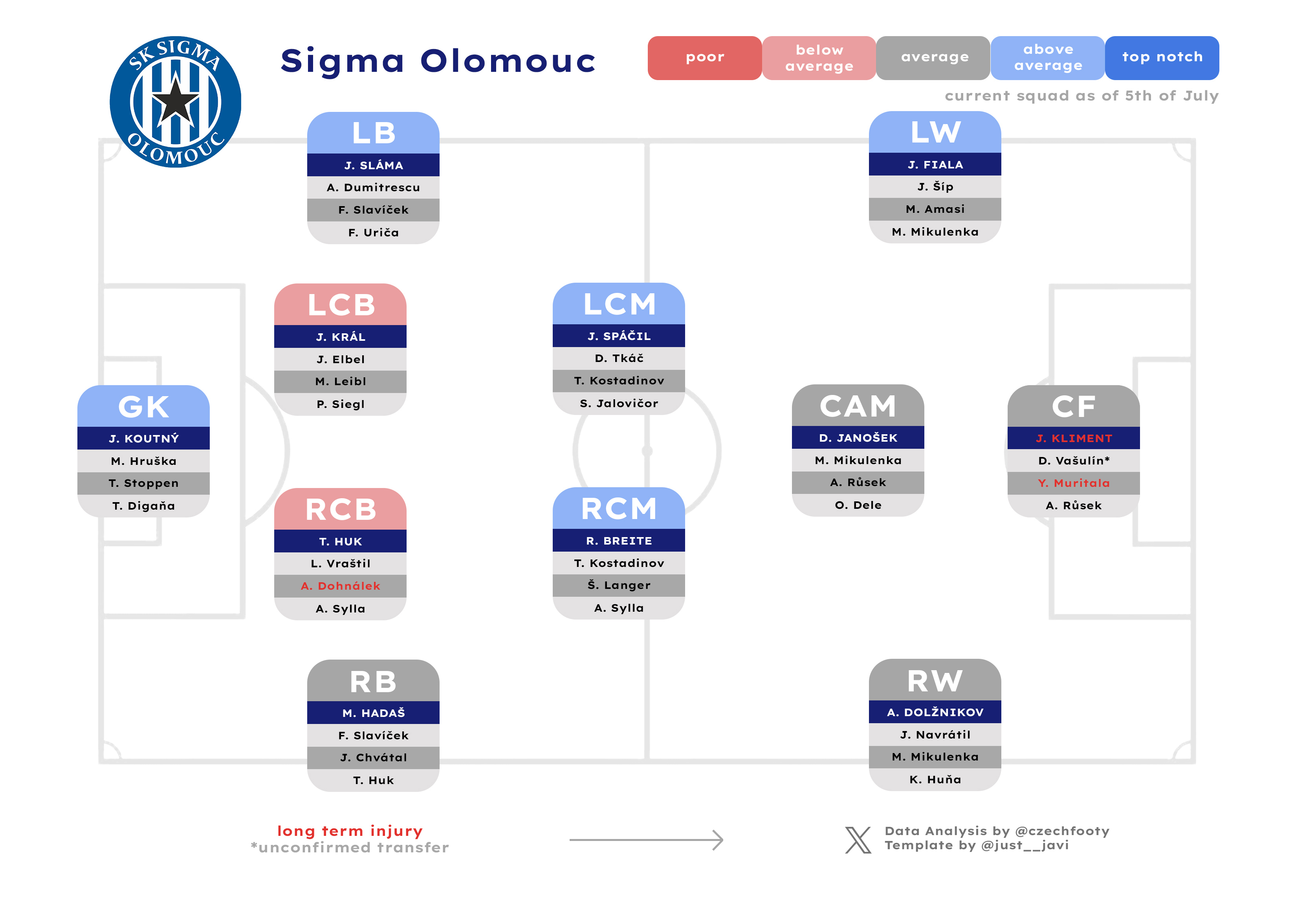
Depth charts are always so tricky to construct because there is always a lot of moving parts over the summer. It is therefore a combination of what is set in stone and what is safe(ish) to presume. The so-called “unconfirmed transfers” are typically not just rumours, but rather cases of players who have already joined up with the new team, with only the specific form of the deal pending to be confirmed. These sometimes also do not turn into an actual deal, but it would feel wrong to leave them out. Who I am typically leaving out, however, are players who’ve got one foot out of the door, e.g. training individually and/or not travelling to the last training camp, ie. Diouf not factoring in for Slavia in 2025.
As for who appears on the depth charts, that is something I often leave out to the publishing day, for the information and order to be the most up to date. The colourful ratings are a different thing entirely, though, as I need a hard deadline to rank teams at one particular point of time. That deadline was now set on Tuesday 21 July, as is stated below the legend. Teams will inevitably swap tags multiple times across the summer, but that can no longer be my concern given the tight publishing timeline.
What’s crucial to note is that I rate the following areas of the pitch to allow for cross-formation rankings:
- Goalkeeping crop (GK)
- Central defence (RCB, CB, LCB)
- Right-hand side (RB, RWB, RW)
- Left-hand side (LB, LWB, LW)
- Central midfield (CDM, RCM, LCM)
- Attacking corps (AM, LAM, RAM, LCF, RCF, CF)
This summer, I am applying one internal rule: whoever features as a no. 1 pick somewhere on the depth chart cannot appear as a backup anywhere else. When it’s notable, I’ll make sure to point it out in text.
For consistency, I am also strictly following this rating breakdown:
- Top notch – 2 best teams
- Above average – 4 teams
- Average – 4 teams
- Below average – 4 teams
- Poor – 2 worst teams
This year, Artis (not previewed) is automatically assigned one of the “Poor” tags, so less dark red. Yay!
Finally, the depth charts are only meant to be a departure point for the section of the preview that follows. They are starting a discussion, not closing it. They are never good enough on their own. Indeed, the lines between the first and second choice — and even more so between the second and third, third and fourth… — are often blurry, something I’ll make sure to note in the write-up below the depth chart; much like any outdated ratings due to occurrences between the 21 July deadline and the publication day.